Case study · 2024—25
Benchmarks AI
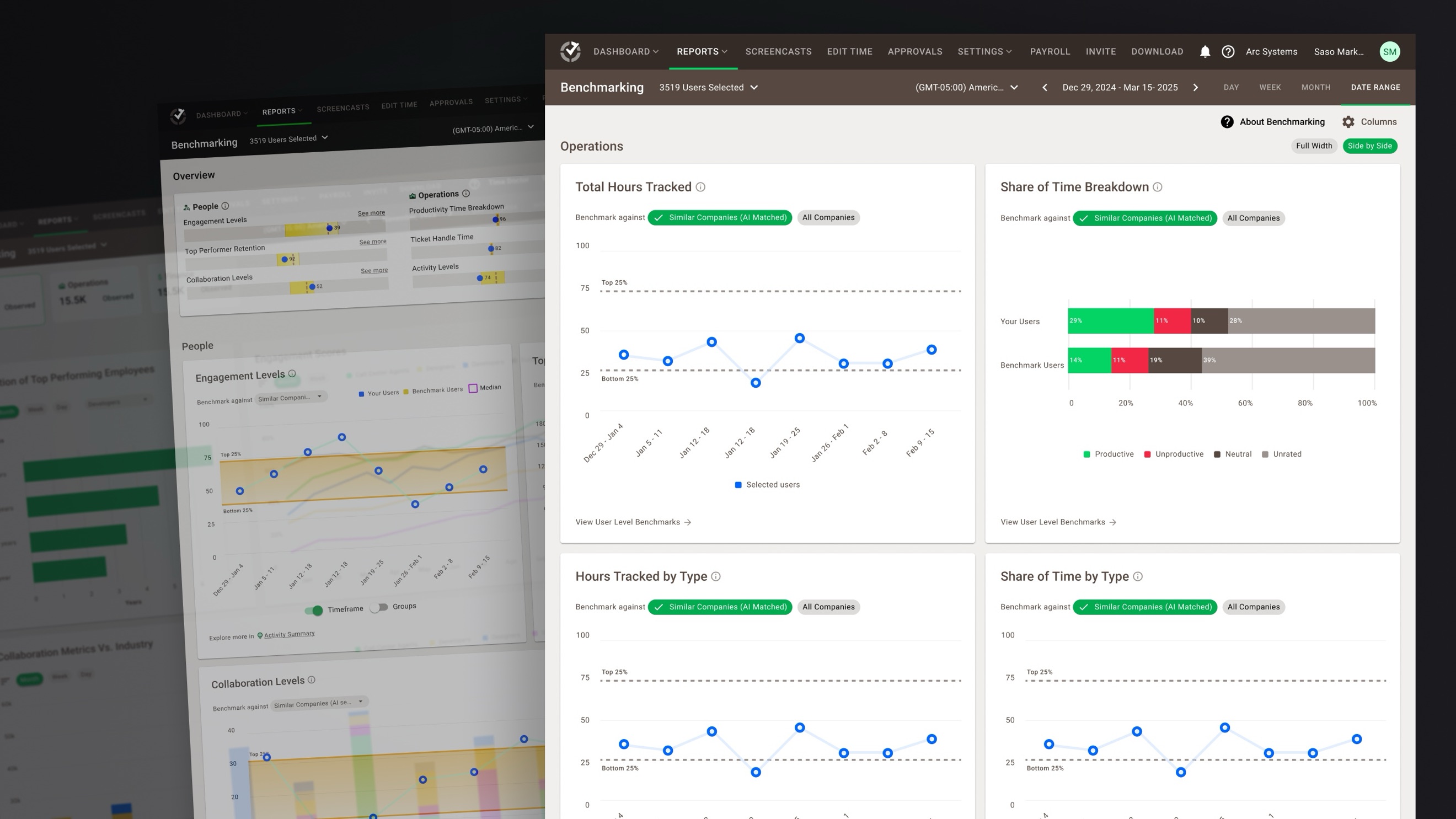
Managers at Time Doctor could see their team's numbers but had nothing to compare them against. Benchmarks AI matches a company to organizations that actually behave like it, so a manager can tell whether a number is good, not just what the number is.
01 · The challenge
Managers had plenty of data. What they didn't have was context for what “good” looked like.
Benchmarks AI lets a team see how its work patterns compare to similar companies, using anonymized data pooled across the customer base — a health check for how your team is working compared to its peers.
It's how a manager finds a gap worth looking at, checks an assumption before acting on it, and opens a conversation about performance with something other than a hunch.
The metrics themselves were never the missing part. Activity and time-tracking data was already there. What was missing was an outside reference point, and without one, reading a performance metric could easily come down to bias or guesswork.
So the product adds relative context rather than another layer of raw data: performance understood through comparison instead of in isolation, for an individual and for the team around them.
Why it matters
- It opens the door to an advisor that can flag anomalies, suggest process changes, and surface top performers on its own.
- It gives the rest of the Time Doctor ecosystem a framework other AI-driven insights can be built on.
02 · Research
Before designing the solution, we tested whether the problem was worth solving.
We started with hypotheses about what managers might want, and instead of arguing about them we tested them — a painted-door experiment built directly into the product.
Interest spiked. So we kept going:
- Interviewed early adopters and internal collaborators.
- Put quick concept visuals in front of people, built on real metrics rather than lorem numbers.
- Ran unmoderated usability tests with non-users on Useberry and Lyssna.
- Followed up with moderated sessions on live prototypes inside Time Doctor.
Running it this lean was the point. It told us what people actually valued early enough that cutting the rest cost almost nothing.
Key insight
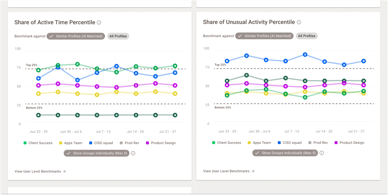
Placing related metrics side by side — Share of Active Time Percentile next to Share of Unusual Activity Percentile — created immediate storytelling clarity. Managers could spot correlations and start conversations without needing extra explanation.
Low active time against high unusual activity is the sharpest example: read together, the pair can point to pretend work — effort that looks busy without producing much. Neither number suggests it on its own. Before Benchmarks AI, assembling that story meant pulling separate reports by hand and already knowing what to look for.
03 · Design
The benchmark isn't based on what a company says it is. It's based on how its workforce actually behaves.
Companies are matched on behavioral similarity rather than self-reported industry or role, which makes the comparison far more accurate than the label a customer typed in at signup.
Experience structure
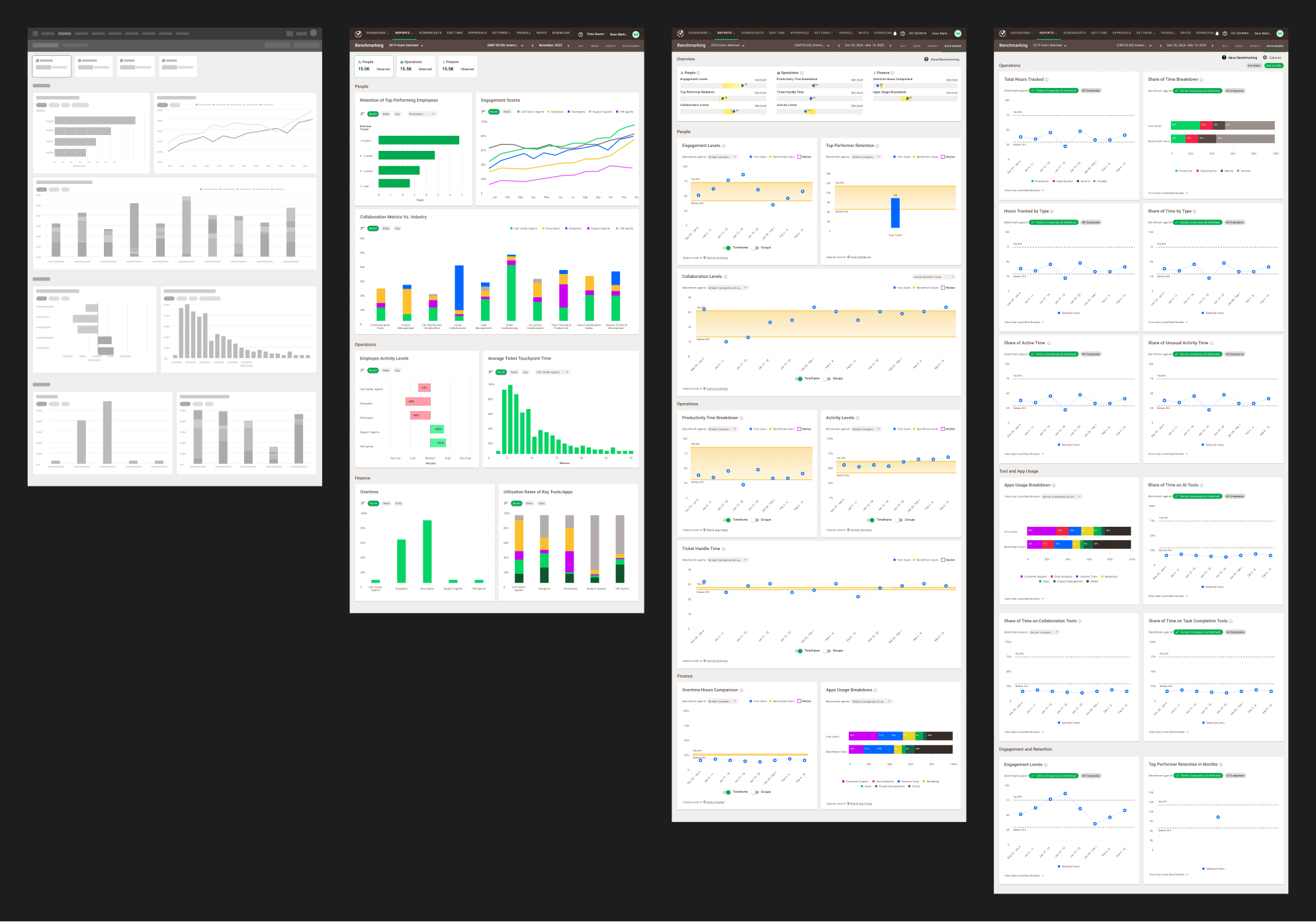
- A dashboard of metric cards, each one a line chart comparing the customer's workforce against anonymized behavioral benchmarks.
- Every chart covers several weeks and opens a side panel for week-by-week detail.
What was hard
- Showing dense data without burying the person reading it.
- Getting the right level of visibility for each role, from owners through HR to team leads.
- Finding a rhythm between the charts so the page could be scanned rather than studied.
- Fitting new visualization patterns into Time Doctor's existing UI conventions.
Validation
Every round of testing changed something concrete: which metrics made the MVP, how the charts were paired, how much the side panel showed at once. None of those decisions survived contact with users unchanged, which is the reason for running the rounds.
04 · Outcome
- Launched publicly inside Time Doctor as a new analytics feature.
- Picked up by internal teams and beta customers for performance reviews and coaching.
- Validated the direction for Workforce Intelligence, the next-generation insight layer.
Benchmarks AI was the first shipped piece of a much longer plan: an AI advisor for productivity. The MVP was never meant to finish that vision. It was meant to put the smallest real version of it in front of paying customers and find out whether the idea held up outside the deck.
The goal was never a finished dashboard. It was a conversation starter between the data, the design, and the people using it.
05 · Reflection
The product stopped being about tracking work and started being about understanding it.
My job wasn't to add more data — there was already plenty. It was to give that data enough context to become useful.
Benchmarks AI proved that direction strongly enough to become the foundation for what we're building next: Workforce Intelligence.
All screens show demo data · No real customer or employee information