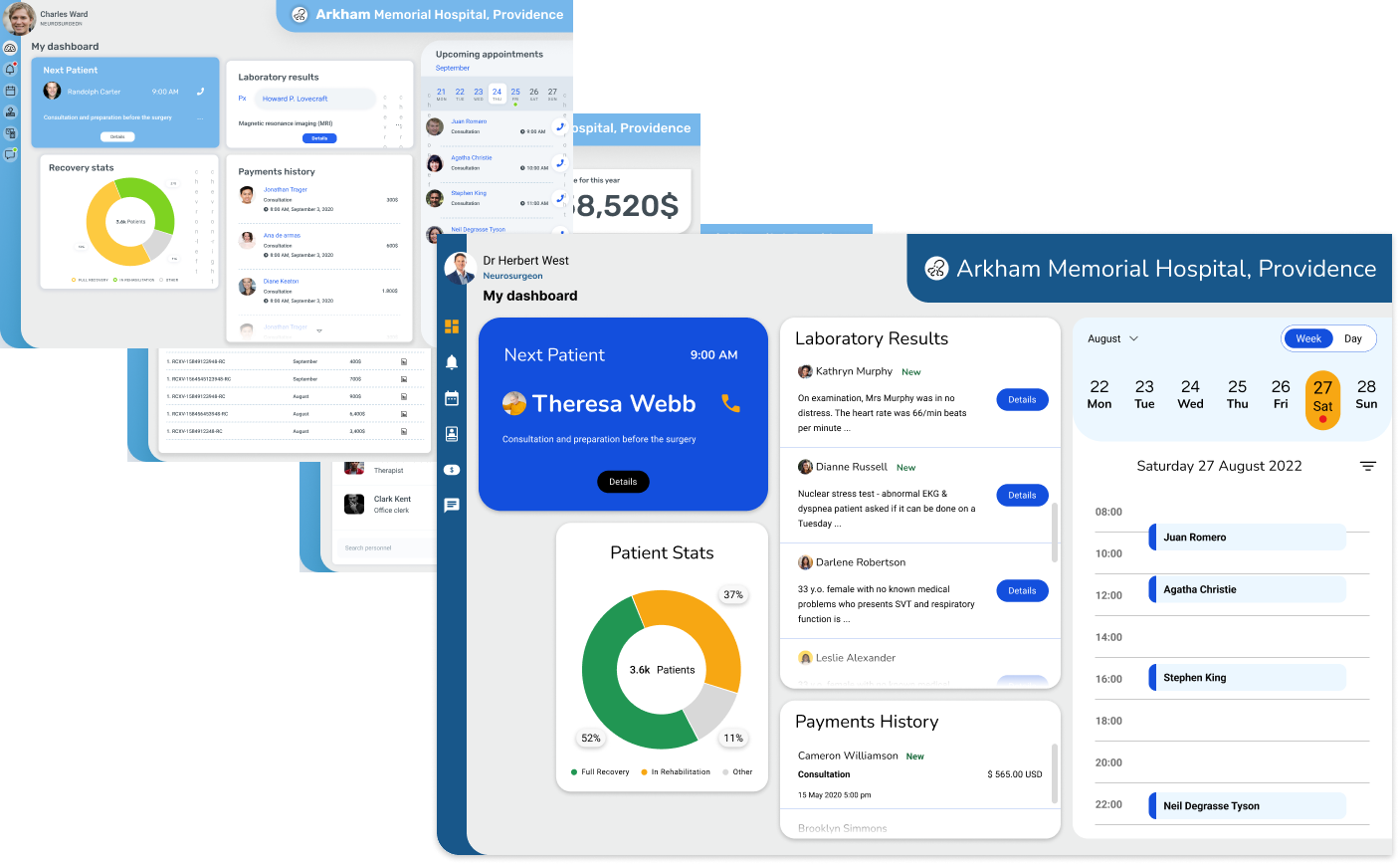
Healthcare Dashboard
Project Summary
One of the companies I worked for was in the healthcare industry, and my responsibilities at the time included working with the development team on improving the web app that had been out there for more than two decades.
Something I’m particularly proud of was improving the available dashboard without completely redesigning the components. To do this, I explored different ideas and in my spare time I also came up with the conceptual design that you’re about to see.
Project completed: 2020, Updated: 2022
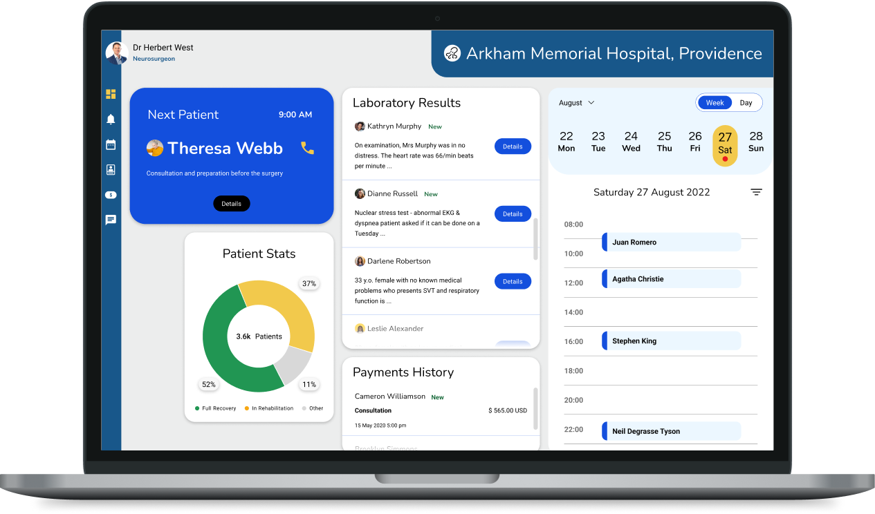
The problem
How do we make it easier for a medical professional to keep track of their activities and patients?
Scope
The purpose of this was to explore UX ideas and standards and practice UI skills. So the main focus was on working on a concept around the existing data and complying with all the criteria for usability
Tools & Methodology
Secondary sources research, pen & paper, Figma
Disclaimer: The information and features shown in this prototype are conceptual, and no information or real features were used, to comply with the client’s NDA.
Tackling the problem
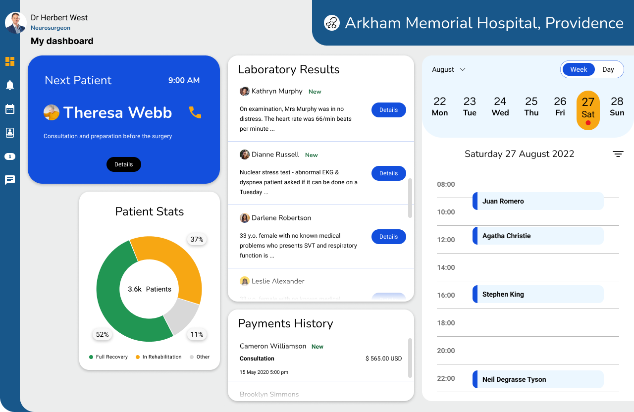
Main dashboard with high-level information
It was important to show a dashboard with high-level information that could show items that mattered, and additional features that could be accessed via the menu on the left side.
All of the information is arranged in a way that shows the importance
Firstly, the patient awaiting to be seen next takes a prominent position on the left-hand side.
Next, a summary of laboratory results
Then, a calendar showing all of the upcoming and current appointments
And lastly, a graph showing statistics and high-level financial information

Additional features
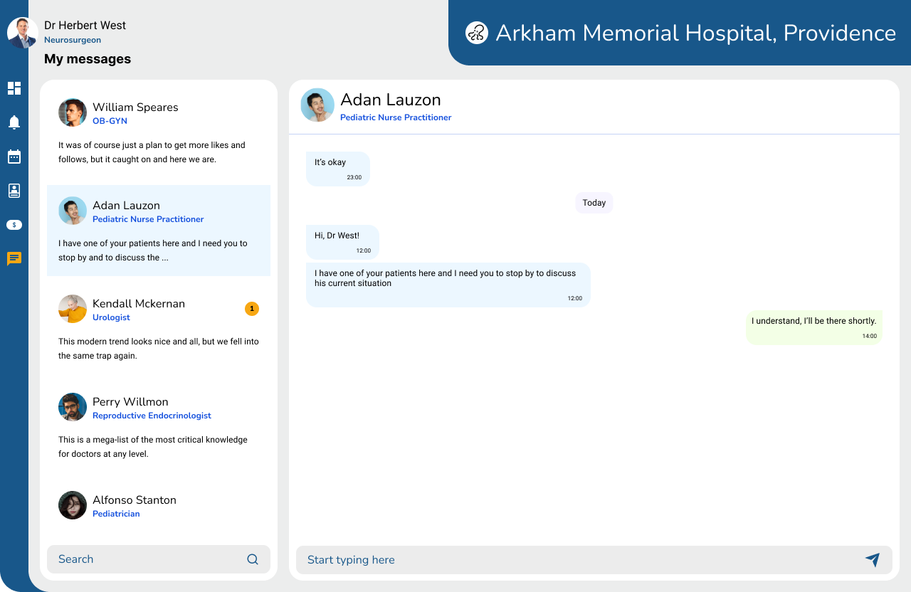
Messaging
Internal messaging with other professionals and personnel working at the same facility
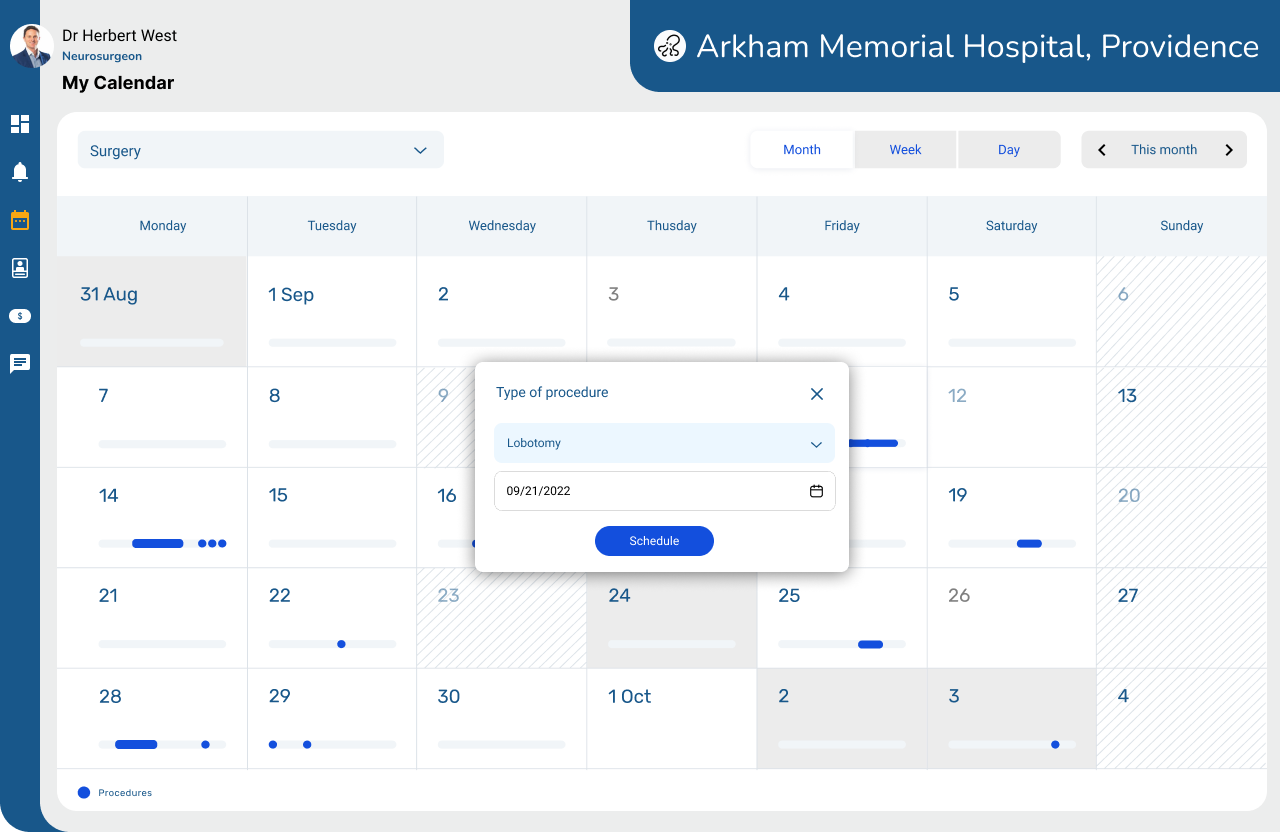
Calendar
A personal calendar optimized to show all the pertinent information
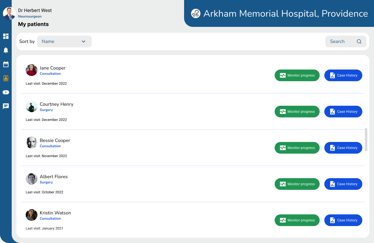
Patients’ list
A database of all the patients under the medical professional’s care
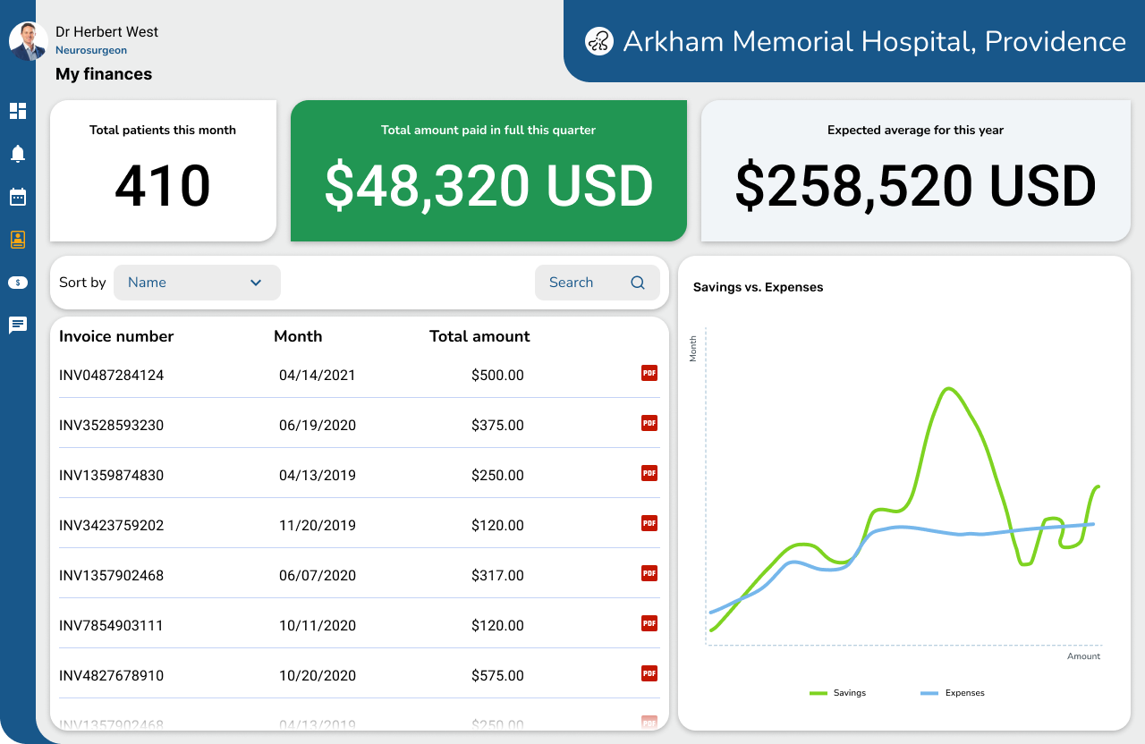
Financial dashboard
An additional dashboard that showed the current financial situation.
UX process conclusion and recommendations
I redesigned the original screens for the purposes of this portfolio, to better reflect the growth in my skills and knowledge
There are plenty of variables one must consider when designing or redesigning an interface. Throughout my years working in UX I found that the fastest way to get better insight is to do a quick usability testing session with actual users, it might seem daunting or expensive, but in reality, it isn’t. I learned this with the Design Sprint methodology and “Don’t make me think” by Steve Krug, concepts I have been successfully applying.
For this particular portfolio piece, what I changed from the 2020 version
Better use of color, more attention to design and accessibility standards, and more empathy with the user and their needs
